OK, sorry about the absence. I'm back. And, no, I'm not going to quit blogging. It just might be a while between posts during those busy times. I'm currently working on a new album concept for Liberty quartet with my good friend Jon Plank. I already know what we're going with, but just for kicks and giggles (nope, never understood that phrase either) I want to hear from you. Which one do you prefer? If you pick the right one, you might win...well, no, to be honest, you're not going to win anything. Just let me know your favorite:
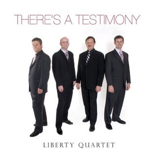
1

2
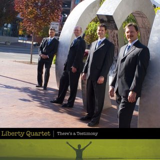
3

4
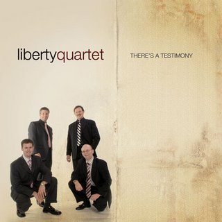
5
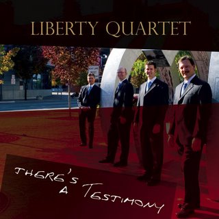
6
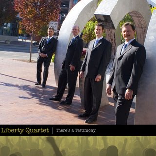
7

8
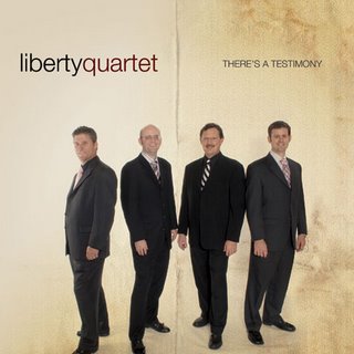
9

10


15 comments:
#1, #2, or #9 would make me happy.
i choose #3! yay! i only chose that one because the green at the bottom accentuates your eyes. (i'm being sarcastic. i was just hoping that if i said that maybe you would change your mind and give me a prize anyway.)
#6 is my pick. It is eye catching and I like the colors. Shanna
#3 then #7 then #8 layered overtop each other with 55% opacity on each.
I actually do like them in that order.
I really like #8!!!
They all look really good!
-Brooke
Our family voted for #4,#6, or #7
#8 is definitely my pick then #10
I like 4 and 5...but aren't they the same? I don't have a keen graphics eye.
Tell me what I've won, Johnny...
#10 and then #8. definitely not 1 or 2
Numbers #4 or #5 are my favorite.
Reasons? I don't care for #1 or #2--just a personal thing. Just seems a little bland. The ones outside make me nervous because it looks like Doran is about to get hit in the head by the curly thing. #9 splits you guys down the middle, making the group look like two duets.
How's that for opinion!? ;)
I agree with Shanna in that I like #6 because of its color. It's more eye-catching than the others.
Neva
#8 or #10 color scheme is great; posing is asthetically pleasing as well.
I like 8 and 9 with a few modifications (there's always a catch, right?).
#8 – I like the shading on the ground - however the sun is too harsh on the faces and the guy in the very back should uncross his hands.
#9 – I like how the picture is closer of the group - however, the feet should not be cut off of anyone and the guy on the end should turn his right shoulder a little more to the camera.
These are just my opinions of course – and only since you asked. I enjoyed looking at these designs.
I would choose #1 or #2. They have the clean, uncluttered look to which I gravitate. I think the rest have a "Bible College Quartet" look to them. Nothing against the quartets, I just thrive on being different.
Definitely 6.
Post a Comment